Components and props
The Props tab shows the Vue instance tree on the page: component names, link to the root DOM node, and props summaries. Full values load when you select a row; you can edit and write back where supported.
Inspect mode, favorites, and the component blacklist are covered on separate pages: Inspect, Favorites, Blacklist.
Top toolbar
Component search
The search field supports several modes. Active criteria come from Search by next to the input. The same options can be preset in Options for this tab.
| Mode | Purpose |
|---|---|
| Name | filter by component name |
| Label | match label string / suitable instance metadata |
| Root | match root element information |
| Key | prop names (including nested), deep search on the page |
| Value | prop values (including nested), query on the page |
Key and Value use a minimum query length (default 2 characters; configurable in inspector search settings).
Partial vs exact. If the query is not wrapped in quotes, enabled text modes use substring matching (case-insensitive). Exact whole-string match applies when the entire search text is wrapped in double quotes "...".
Inspect next to search picks a node on the page to filter the list; see Inspect.
Status chips
Right side of Props:
| Item | Purpose |
|---|---|
| Filtered (amber badge) | A page-element filter (Inspect) is active. Click clears the filter and restores the full list. |
| N or N/M | Visible rows after filtering; with a non-empty search, M is total components in the snapshot. |
| Favorites ★ | Matches between the current tree and saved favorites. Click opens Options favorites. |
| Update | Refresh button and last snapshot time (lastUpdated). |
Work area
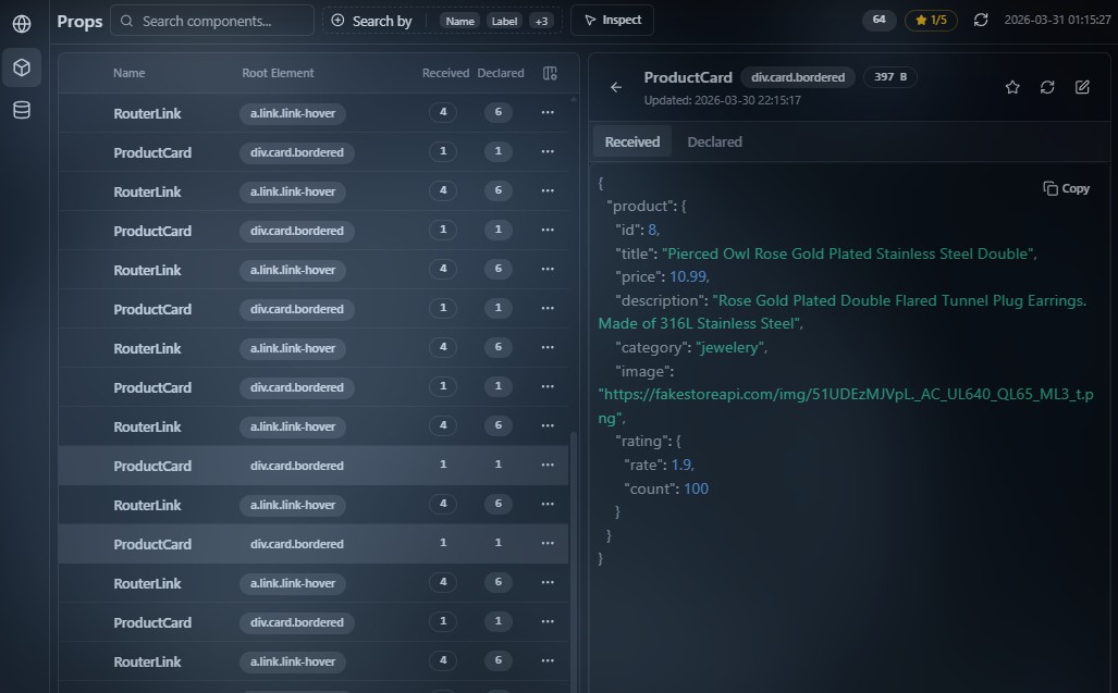
Component list
Left: the component table. Main columns (visibility in table settings):
- Name — component name;
- Root Element — root DOM info for the instance (tag, classes, id when available);
- Received — count of props actually passed;
- Declared — count of props declared on the component.
Hovering a row highlights the matching node in the page.
The row context menu and star connect to Favorites and Blacklist.
Component details
Selecting a component row opens a detail panel for that component.
Summary header
The top of the panel shows:
- component name;
- short root DOM info (tag and classes);
- size of the serialized Received tab payload;
- an Updated: line with the last update time for the node data.
Component data
Two tabs below:
| Tab | Purpose |
|---|---|
| Received | props actually passed; view and edit supported |
| Declared | declared prop definitions (rawProps); view only |
Both tabs are always available.
The active tab is shown as JSON—text or tree—according to inspector settings.
The editor supports copying the contents.
Navigation
- ← Back closes details and returns to the table;
- Esc in edit mode discards edits;
- Esc outside edit mode returns to the list.
Controls
| Control | Purpose |
|---|---|
| Star | add or remove from favorites; always available |
| Refresh | re-fetch the selected component from the page; temporarily disabled while a refresh runs; hidden in Edit mode |
| Edit | enter edit mode; only on the Received tab |
Button order in the header (view mode): Star → Refresh → Edit.
Edit mode
Edit applies only to the Received tab.
When editing, Refresh and Edit become Cancel and Save. Star stays available.
| Before editing | In edit mode |
|---|---|
| Refresh | Cancel — revert the draft to the last loaded props and leave edit mode |
| Edit | Save — write changes to the app |
- Save is disabled if JSON fails validation;
- changes apply only after Save;
- if save fails, edit mode may remain—watch UI messages and the console.
The favorite star in this panel and in the table is described on Favorites.
Card data reflects the last successful update for the selected node—use Refresh in the detail header to re-query props from the page, or toolbar Refresh on Props for a full snapshot refresh.
Display limits
Reading limits
Props on demand: opening a card reads and serializes values for the detail panel; heavy objects hit serializer limits (below).
The light table sends metadata and counts without full serialization of every value on each update.
Storage
There is no fixed “N rows like Network” cap for Props: size depends on component count and injected-side cache policy (snapshots are pruned where a node is not expanded and not needed).
To avoid blocking the page main thread, prop serialization applies limits including:
- time budget per serialization pass;
- max nesting depth and array/object size;
- long string truncation and a cap on nodes per response.
Very large or cyclic structures may appear incomplete or marked as truncated—expected safeguard behavior.
How it works
When collection starts
The Props module attaches after Vue is detected on the page (unlike Network, which starts with the general inspector script). Until Vue initializes or the inspector is injected in the tab, the component list stays empty.
After the first successful load you can refresh manually (Refresh) or on a schedule (auto refresh in Options).
What is monitored
- Structure — walking Vue instances yields a flat list with metadata (name, label when present, element binding, received and declared counts without full values every frame).
- Props on selection — full values load when you open a card (lazy).
The same channel refreshes after Toolbar Refresh, respecting the active blacklist (name filtering during collection—see Blacklist).
Messaging model
The panel does not read Vue memory directly: it sends a message to the page; injected code walks instances and returns serialized data.
Simplified flow:
// Illustration: UI requests the component list; the page scanner builds structure.
const response = await bridge.send({
  type: 'COLLECT_VUE_COMPONENTS',
  forceRefresh: true,
  blacklist: { active: ['SomeNoise'], inactive: [] },
})
// response.components — names, uid, prop counts, Root Element strings…
// Full prop payloads load separately when a card opens (lazy).
This separates the light table from heavy prop reads for the selected node only.